
The Goal
Design a workflow for a web-based application that allows title inspectors to gather documents, organize them, annotate cover sheets, and send the package to underwriters.
Who, Why, How, What
Who was the user?
The target users are title inspectors working for title insurance companies. They are experienced professionals who perform the task of title chaining, ensuring that properties have clear ownership and are free of claims. These inspectors typically work with property records and are highly concerned with accuracy due to the high financial risk involved in their job. The inspectors often need to process multiple properties per day.
Why solve the problem?
Traditionally, title inspectors have to physically visit courthouses to retrieve records, which is both time-consuming and prone to human error. The goal is to automate and streamline this process to improve efficiency while reducing the chance of costly mistakes. By digitizing the workflow, inspectors can save time, increase the volume of inspections, and ensure more consistent, error-free results.
How did we solve the problem?
The design prioritizes a streamlined, efficient process that reduces unnecessary steps. The workflow automates the document retrieval, organizes the information, and provides an intuitive interface for the title inspector to easily bundle and annotate documents. Special care was taken to allow for exceptions (like claims) to be handled separately, and for the system to support manual document searches due to inconsistent data across counties. Additionally, the design minimizes cognitive load by consolidating information into a single screen in the final step.
What was the solution?
The solution is a web-based platform that allows title inspectors to search for and retrieve property records from various county databases. The system supports digital document storage, automated bundling of documents, and allows for annotation of cover sheets to indicate whether the title is “free and clear.” It ensures that inspectors are not forced into unnecessary steps, and exception handling is integrated seamlessly for claims and other rare scenarios.
Process Deepdive
Grid System and Layout Choice
I decided to work with a 3-column grid system, which offered flexibility while still maintaining structure. This grid helped in organizing the persona’s various elements such as the title, biography, goals, challenges, and motivations. By leaving room for margins and maintaining an asymmetrical composition, I ensured that the layout felt dynamic and well-spaced.
Typography
For this persona, I used a mix of typefaces and weights to establish a clear hierarchy. The headlines were bold and larger in size, while body text was kept simple and readable. For the quote, I used stylized the font further with color and size to act as an focus point for the reader. The typography was chosen based on both its legibility and its ability to engage the user visually. I used clear, easy-to-read fonts that followed the principles of legibility, especially for those reading in print.
Visual Hierarchy
Hierarchy is crucial when presenting information in a persona. I carefully grouped information into sections to guide the user’s eye across the layout in a logical, smooth flow. Key demographic information appeared at the top left followed by the persona’s story, motivations, skills, challenges and goals. This created a clear visual path from left to right and top to bottom, ensuring that the reader could easily understand and follow the persona’s details.
White Space and Composition
One of the most important decisions in this layout was the effective use of white space. It allowed for a clean, uncluttered look, helping each section breathe and making it easier for the user to absorb the information. I intentionally left ample margins around the edges of the page to keep the layout from feeling cramped. This also allowed the content to feel less overwhelming to the user, particularly in a document that could be viewed in both digital and print formats.
Color and Contrast
For the color scheme, I kept it minimal with shades that ensured both legibility and visual appeal. The contrast between text and background was considered carefully to maintain readability, especially for those reading in print. Soft colors were used for section dividers to subtly separate content without overpowering the primary information.
Consistency
Throughout the persona, I made sure to maintain consistency in the design elements. The font choices, color scheme, and layout structure were uniform throughout the document, making the persona visually cohesive. This consistency helps establish professionalism and makes the persona more trustworthy and credible in a UX context.
Artefacts
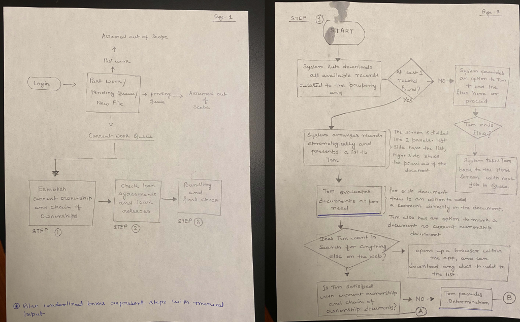
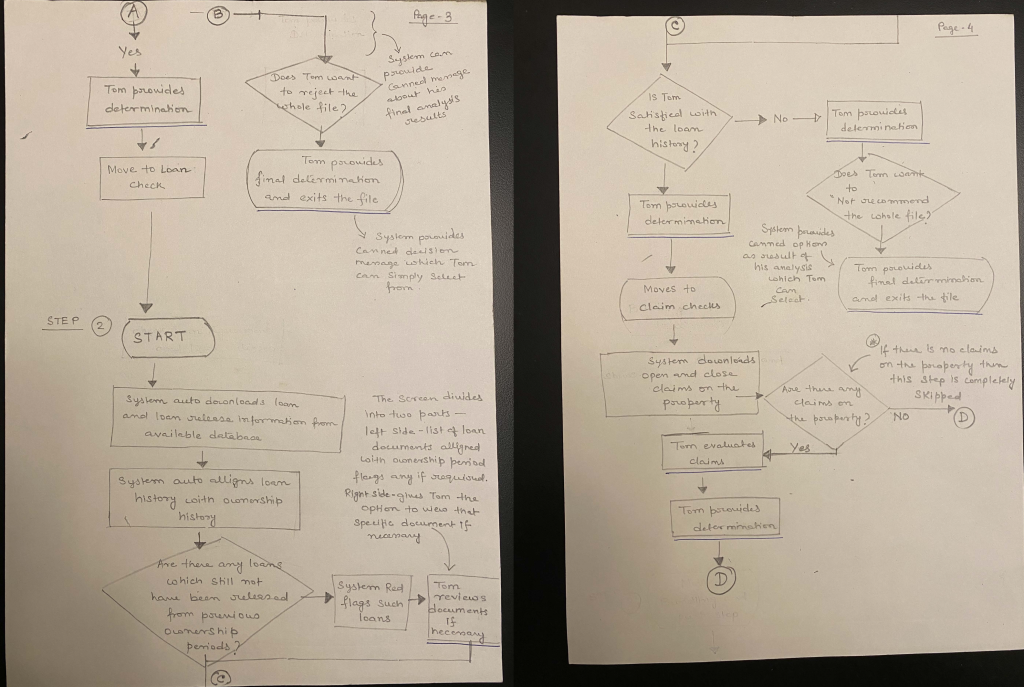
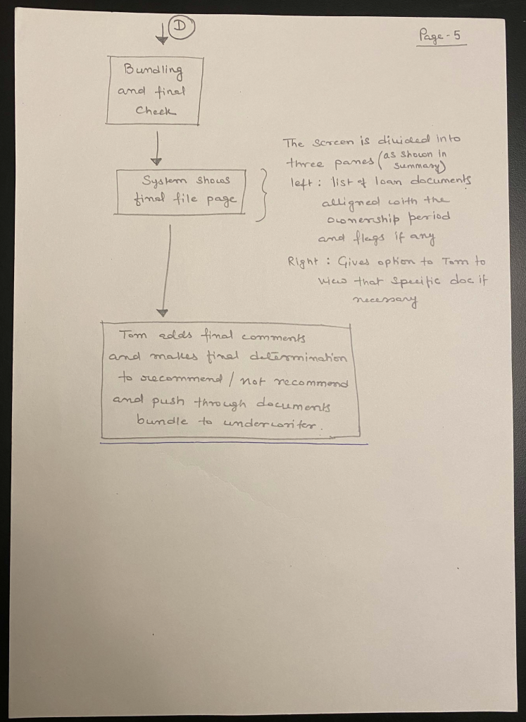
For this exercise, we were specifically asked to avoid using software to map the workflow, rather put pen to paper and draw the workflow by hand.
Leave a Reply