
The Goal
To assist a hypothetical startup company called ReminderX, that has built and launched a basic to-do list and reminder app for iPhone and Android completely reimagine their offering by running through a comprehensive user research and redesign exercise. The goals are to identify target users, uncover their needs, and propose solutions to differentiate the app and address user pain points.
Who, Why, How, What
Who was the user?
The target users were undefined at the beginning of the project. Through primary user research, potential target groups were identified, with a focus on individuals seeking efficient, intuitive, and engaging to-do list and reminder solutions. The target persona was identified as white collar professionals between ages of 35 – 45 years who have a family or active social lives and are extremely busy. They simply don’t have the mental bandwidth to remember, coordinate, organize and prioritize personal and professional tasks. This makes them heavily dependent on reminder/calendar apps that are secure, reliable, efficient and help them remain sane in a sea of tasks and commitments.
Why solve the problem?
ReminderX operates in a saturated market of generic to-do and reminder apps. To scale and grow, the company needed a well-defined product vision, rooted in user insights, to stand out and achieve product-market fit. The goal was to understand user pain points, prioritize them, and propose innovative, user-centered solutions to address these issues.
How did we solve the problem?
The project followed a design thinking approach, broken into six key stages:
- Iterate – Used feedback to improve the prototypes and create polished design artifacts.
- Empathize and Discover – Conducted user research to understand pain points and needs.
- Define – Identified a target user segment and articulated their needs.
- Ideate – Proposed solutions to the identified problems.
- Prototype – Created low and mid-fidelity wireframes to visualize workflows and user journeys.
- Test – Collected feedback from users to refine designs.
What was the solution?
A user-centered approach led to the creation of actionable insights, design tenets, personas, and iterative prototypes. These deliverables form the foundation for ReminderX’s next steps in development and differentiation.
Process Deepdive
Research and Personas
Conducted 1:1 interviews with four participants representing different potential user groups. Findings were synthesized into a design brief, which included a persona representing a target user. This persona guided design decisions, ensuring they aligned with user needs and goals. The following key design tenets were defined to guide the redesign of the app
- Minimize steps to complete setup,modify or remove events.Use reliable integrations and automation wherever possible to drive actions. Use alternative I/O methods for direct interaction
- Provide options for easy and intuitive customization and prioritization of events. Color tagging, automated prioritization based on event content etc.
- Use clean minimalistic design elements and familiar patterns to reduce cognitive load. Success is achieved when the user can meet their needs without realizing that they are using this app. They should not have to “learn” to use this app separately.
- Leverage user preferences and customizations to design information delivery methods which meet the context and motivation of use. Combine user inputs with AI based event details recognition to customize reminders and notifications (E.g – A flight’s reminder may come a day in advance vs a reminder to pick up their laundry)
Low-Fidelity Wireframes
Hand-drawn sketches were developed for four key user journeys, including:
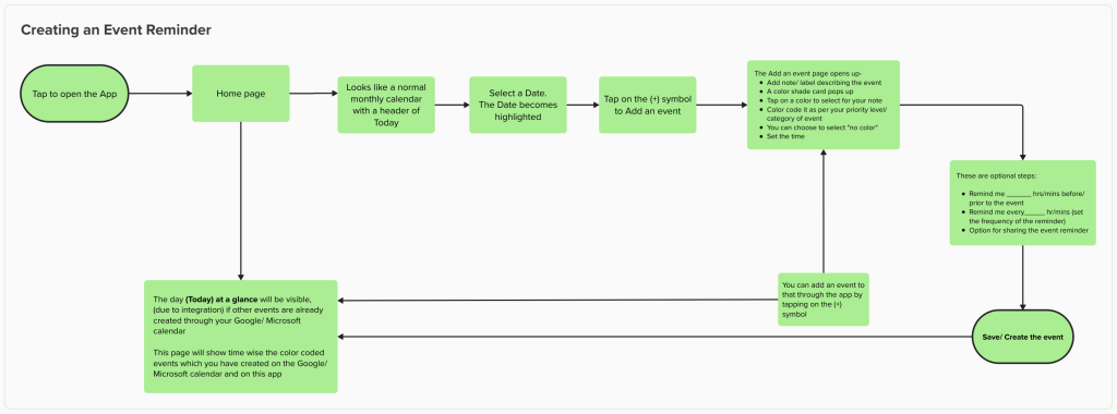
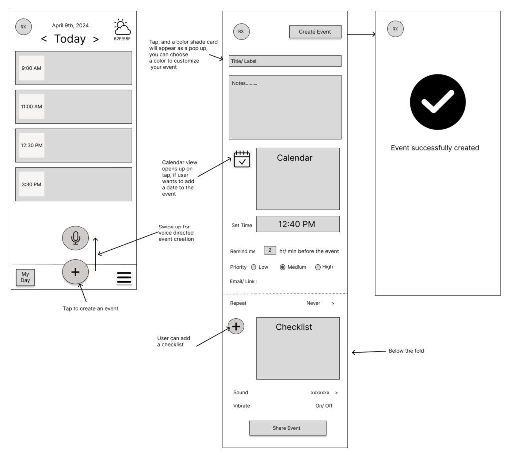
- Task Creation – A quick and seamless flow to create reminders.
- Daily Task Overview – A personalized dashboard summarizing daily reminders.
- Task Completion – A gamified approach to encourage task completion.
- Recurring Tasks Setup – An intuitive way to set and manage recurring reminders.
Wireframes were critiqued, and feedback was incorporated through two iterative cycles.
Mid-Fidelity Wireframes
The refined designs were translated into digital wireframes using Figma. These static designs detailed screen layouts, user actions, and workflows for the app, offering a polished visual representation of the proposed solution.
Success Criteria
- Project-Based: Timely delivery of all milestones, including the design brief, wireframes, and weekly updates.
- Product Metrics: Hypothetical success indicators such as acquisition rates, user activation, retention, and referral rates for evaluating the redesigned app.
Artefacts
- User Research Interview Protocol
- Design Brief
- Insights from user research.
- A persona detailing user characteristics, pain points, and goals.
- Design tenets reflecting user-centric principles for app design.
- Low-Fidelity Wireframes
- Four user journeys, annotated with design philosophies and reasoning.
- Mid-Fidelity Wireframes
- Polished static designs created in a digital tool, showcasing the proposed app interface.
Leave a Reply