
The Goal
Ensure the accessibility of a vacation rental webpage by annotating its wireframe with actionable and specific guidance. These guidelines aim to make the webpage inclusive, usable on various devices, and accessible to users with disabilities, including vision and motor impairments.
Who, Why, How, What
Who was the user?
The primary users of the annotated wireframe are a front-end web designer and developer tasked with building the vacation rental website. Indirectly, the end-users are prospective renters, including individuals with disabilities, who need an accessible and seamless browsing experience.
Why solve the problem?
Accessibility is not just a regulatory requirement but a critical factor in delivering an equitable user experience. The couple’s rental property highlights wheelchair accessibility, which aligns with the broader goal of inclusivity. An accessible website helps the owners reach a larger audience, ensuring usability for all potential renters.
How did we solve the problem?
The solution integrates principles of universal design, emphasizing responsiveness, clarity, and ease of navigation. Actionable annotations were added to the wireframe to ensure visual, auditory, and interactive accessibility. These guidelines were informed by best practices in assistive technology and accessibility standards, focusing on areas like navigation, text alternatives, form usability, and progressive disclosure.
What was the solution?
The annotated wireframe outlines a structured, accessible design that accommodates a range of disabilities. Key features include sequential tab navigation, screen reader compatibility, responsive adjustments for mobile layouts, and an accessibility toolbox for user customization.
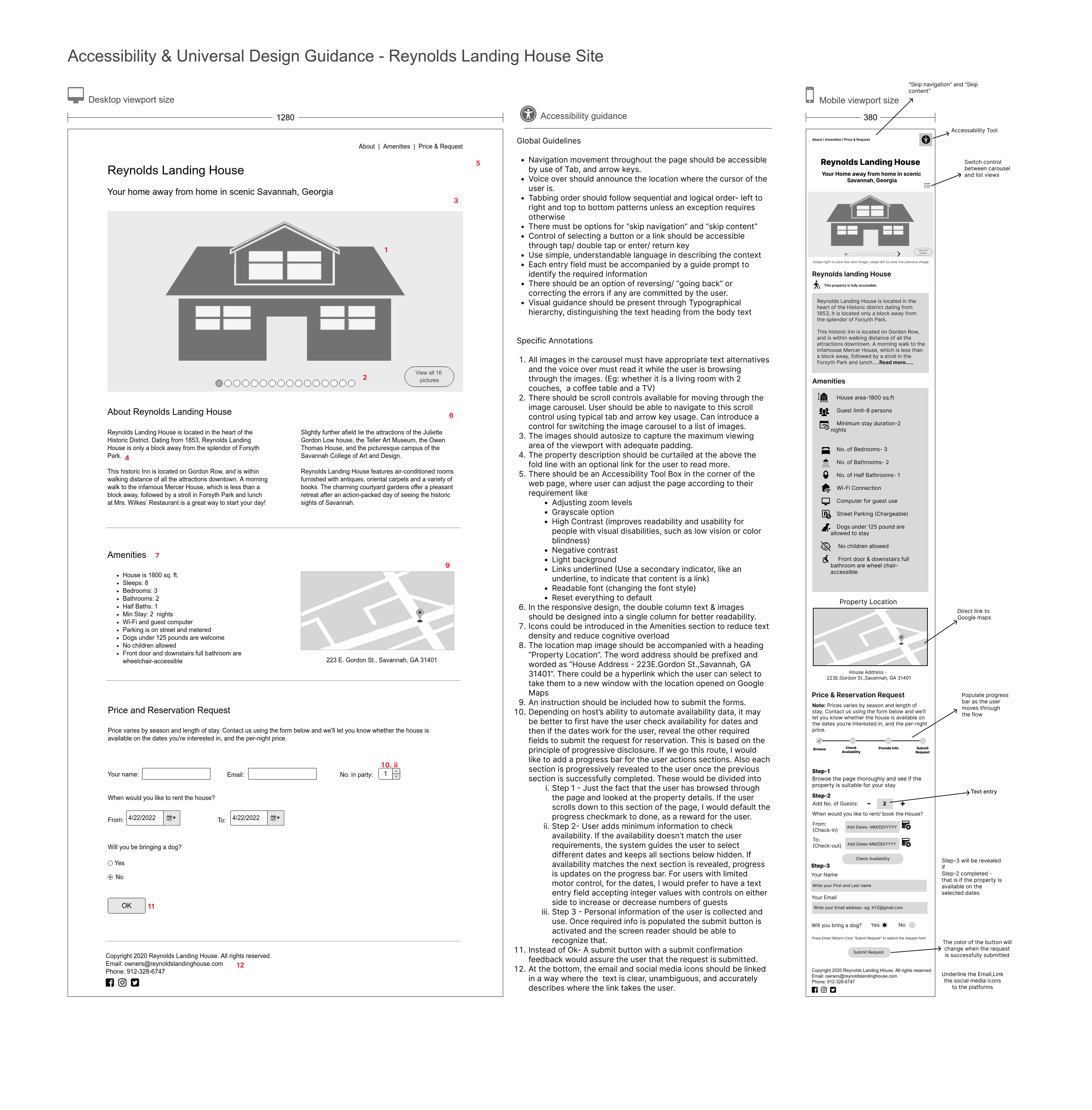
Process Deepdive
The project was carried out in three main stages:
- Wireframe Creation
Based on the couple’s inputs, a desktop wireframe was designed to showcase property details, amenities, images, and booking options. Preferences like a large image slider and two-column content areas were incorporated while maintaining a balance between aesthetics and functionality. - Feedback and Revision
Feedback was collected, leading to refinements such as improving content hierarchy, reducing text density, and enhancing visual appeal. - Accessibility Annotations
Using accessibility guidelines, annotations were added to the wireframe. Specific considerations included:- Navigation: Ensuring smooth tab and arrow key navigation, logical tab order, and a “skip navigation” option.
- Image Descriptions: Providing meaningful alt text for carousel images to assist screen readers.
- Form Usability: Including error correction options, guide prompts for input fields, and a clear submission confirmation message.
- Progressive Disclosure: Segmenting the booking process into logical steps to reduce cognitive overload.
- Responsive Design: Adjusting the two-column layout to a single column on mobile for readability.
Artefacts
The image above represents the deliverable generated out of the exercise. Here is a high res version of the image for you to zoom in and take a look.
Leave a Reply