
The Goal
Provide a detailed critique and redesign of a dialog box in a web-based application used by accounting and credit departments for monitoring companies’ financial stability. The critique evaluates the usability of the design in context, while the redesign focuses on improving user experience by addressing identified issues.
Who, Why, How, What
Who was the user?
The users are professionals in accounting and credit departments tasked with making decisions based on the financial solidity of companies. Their primary goals include setting up monitoring for companies they interact with repeatedly, enabling them to receive alerts about changes in financial stability or payment behaviors. These users are detail-oriented and accustomed to working with data-heavy systems.
Why solve the problem?
The dialog box serves as a critical component in enabling users to monitor companies effectively. However, the existing design introduces usability challenges, including cognitive overload, confusing language, and inadequate feedback mechanisms. These issues can lead to user frustration and errors, potentially impacting business decisions. Addressing these problems ensures the dialog aligns with users’ mental models, reduces friction, and facilitates faster, error-free task completion.
How did we solve the problem?
By evaluating the current design through usability principles and user-centered design techniques, the critique identified key areas for improvement. These included visual hierarchy, readability, and actionable feedback. The redesign reorganizes the layout, simplifies language, and introduces constraints and affordances to guide users through their goals intuitively.
What was the solution?
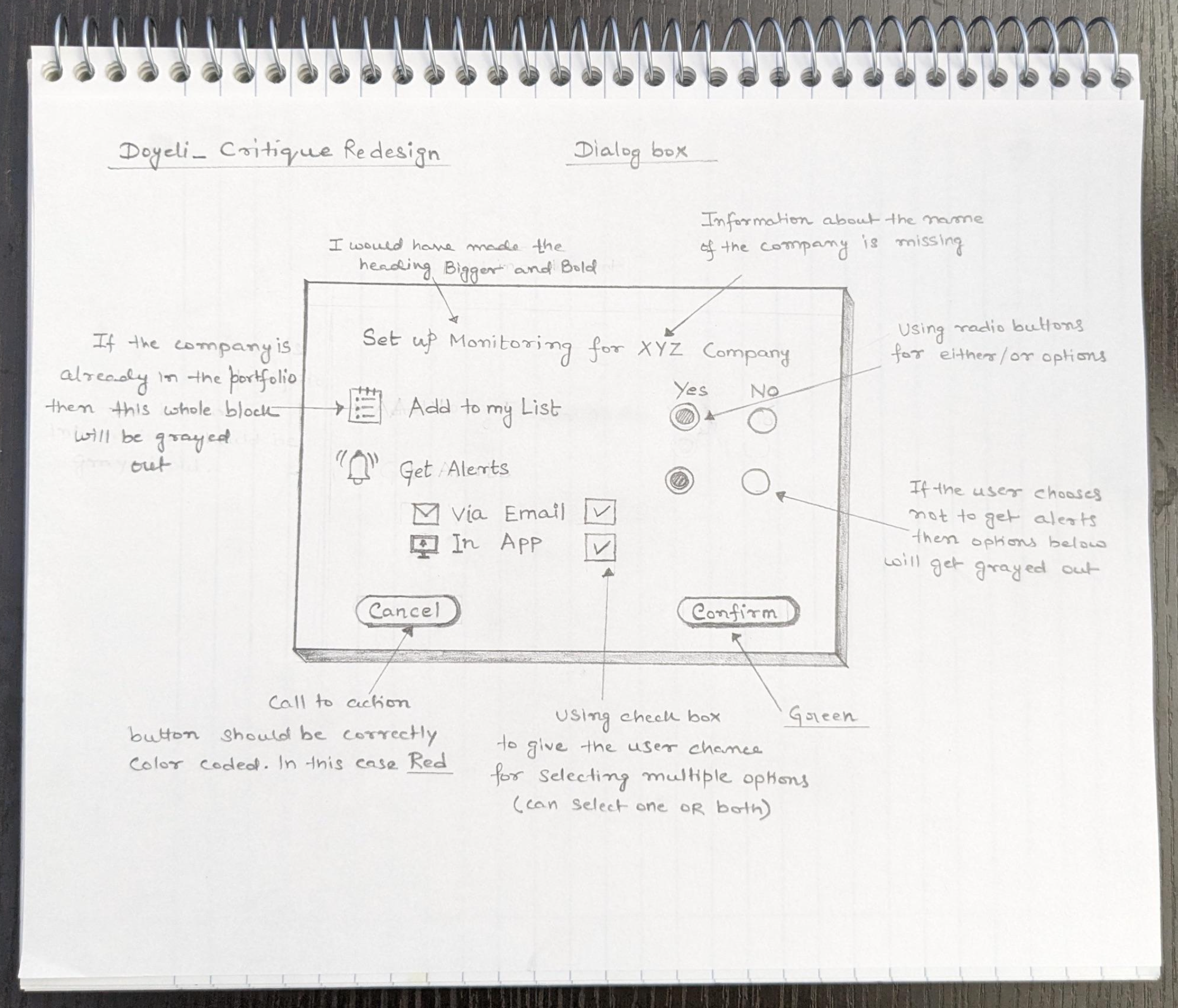
The redesigned dialog box separates the two independent user goals—adding a company to a list and setting up alerts—into distinct sections. The interface highlights the company name, reduces redundant text, uses intuitive affordances like checkboxes and icons, and employs clear, visually distinct call-to-action buttons. Constraints, such as grayed-out options for already completed actions, ensure users only interact with relevant parts of the dialog.
Process Deepdive
Critiquing the Original Dialog Box
The critique revealed several design flaws that negatively impacted usability:
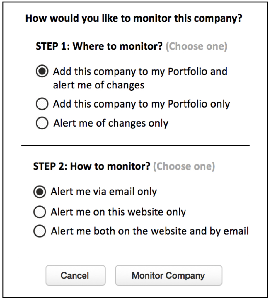
- Confusion Between Steps: The original design presented two independent tasks—adding the company to a portfolio and setting up alerts—as sequential steps. Labeling them “Step 1” and “Step 2” implied a required flow, which was not the case. Users might incorrectly assume they must complete the first task to access the second.
- Call-to-Action Button Proximity: The buttons for confirming and canceling actions were visually similar and positioned close together. This lack of differentiation increased the risk of accidental errors.
- Poor Visual Hierarchy: The header lacked prominence due to its font size and weight, making it difficult for users to quickly grasp the purpose of the dialog. The options within each section were also visually cluttered, which compounded cognitive overload.
- Unclear Vocabulary and Redundancy: Terms like “Monitor” and “Portfolio” were not user-friendly or consistent with common conventions. Repeated text, such as “Choose one,” was unnecessary and detracted from the main content.
- Lack of Feedback and Constraints: The design did not indicate if a company was already in the portfolio or provide feedback when actions were unavailable. Users had no clear guidance on how to handle scenarios like multiple portfolios.
Redesign Process
To address these issues, the redesign was guided by user-centered principles and visual design best practices:
- Independent Goal Sections: The layout was divided into two distinct areas: “Add to My List” and “Set Alerts.” This separation clarified that the goals were independent, preventing unnecessary confusion about task order.
- Enhanced Visual Hierarchy: The company name was prominently displayed in the header to anchor the user’s context. Section headers were clearly distinguished through size and weight, ensuring users could quickly identify and navigate their options.
- Improved Call-to-Action Buttons: The confirm and cancel buttons were visually distinct, with color coding to signify their functions (e.g., green for confirm, red for cancel). This reduced the risk of misclicks.
- Simplified Language: Redundant text was removed, and terms were replaced with simpler, more intuitive alternatives (e.g., “List” instead of “Portfolio,” “Track” instead of “Monitor”).
- Contextual Feedback and Constraints: If the company was already in the list, the corresponding section would be grayed out and labeled accordingly. Similarly, alert options would be disabled if the user opted not to set up alerts.
- Intuitive Affordances: Icons were added to represent email and in-app alerts, making choices easier to interpret at a glance. Checkboxes replaced redundant radio buttons, providing a cleaner, more intuitive interaction model.
Artefacts
For this exercise, the main artefacts were the design review document and the redesigned dialog box. The design review observations have been threaded into the process deep dive content and the original and redesigned dialog boxes have been presented earlier in this post.
Leave a Reply