
The Goal
Create a basic type system utilizing the principles of typography and graphic design. This should be a 6-level deep type system, with a font choice for each level: Headline, Subhead, Intro Text, Body Copy, Pull Quote/Call Out and Caption/Footnote. The design should be informed by the needs of your target user.
Who, Why, How, What
Who was the user?
I assumed that my target user base are kids aged 6-10 reading printed storybooks.
Why solve the problem?
In a real world scenario, the necessity for the typesystem design could be based on user feedback and/or business metrics. Hypothetically such a design would be done during the initial design stages of the book/publication.
How did we solve the problem?
The design was based on the functional and emotional needs of the target user. I considered typeface categories, posture, weight, width, point size, tracking, kerning, leading and word spacing and cohesiveness of the font pairings to effectively represent the content hierarchy.
What was the solution?
Process Deepdive
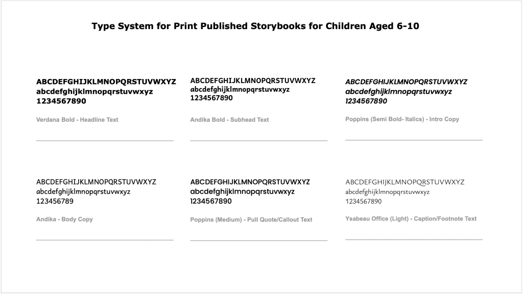
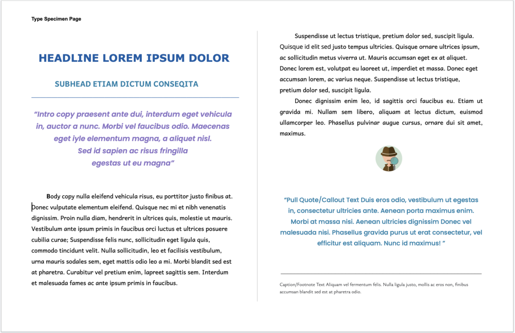
The specimen represents a chapter beginning of a story book for kids Age (6-10). I have used four types of fonts in my entire layout. They are Verdana, Andika, Poppins and Ysabeau Office. All these fonts are categorized under Sans Serif. The reason I have chosen the following fonts are discussed below:
- Verdana- The Verdana family resembles humanist sans.The characters are very distinctive which improves readability. Commonly confused characters, such as (i, j, l) in lowercase and (I,J,L) in uppercase and the numeral 1 have been designed so that people can easily make out the difference between them. Verdana’s generous width and spacing is the focus point of creating legibility of its font on the layout. Hence I chose it for the headline.
- Andika- I have chosen the Google font Andika for the Subhead and the Body Copy. This font has been designed especially for literacy use and focuses on the needs of beginner readers. It is characterized by clear, easy to understand letter forms, and is less cluttered than many of the fonts under sans serif. Considering my target category of users (Age – 6 to 10), we can assume that they have started their journey as readers. Sometimes reading becomes a slow process to recognize each character and then put it together to form a word. This font perfectly helps in that journey. The counter in this font family is round and open making it look warm and friendly and the X-height is large enough to help smooth reading. My aim was to provide them with a font which has sufficient gaps between two words (spacing) and also between two lines (leading). This will help each word to stand out prominently in body copy. This font also looks fun and cozy because of the smooth curve endings of each character. I also used this for the sub-head to help the user’s movement through the page. The header’s weight and size makes it pop, while the intro text’s attractive style pulls the reader into the body. To achieve this effect, I intentionally kept the sub-head lowkey so that the user’s movement through the page is smoothened out.
- Poppins- This belongs to the family of Geometric sans serif typefaces. Poppins is one of the newly created typefaces that has “eye-catchy curves”. This is the reason I chose this typeface for Intro Copy and Pull Quote/Callout. I have used it in different weights and styles in two different spaces like Semi bold with italics in intro copy and medium in Pull quotes. This typeface is famous for its legibility and multifaceted use ranging from editorial design to web and mobile interface. This was another reason to choose this typeface. My target users are a digital first generation, where they are constantly consuming content from screens. So by choosing this font to be used on paper media, the transition for the user between different media is effortless. It perfectly attracts the users attention to read this typeface first when looking at a glance on a page layout. Maybe this is the reason why Google Fonts (About & License) page shows that the Google Fonts API served Poppins 8.1 Billion times over the last week. Poppins is featured in more than 14,000,000 websites internationally.
- Ysabeau Office – I have specifically used this typeface for footnote text because, footnotes usually have small typeface size and this has an “unencumbered crispness of a clean low-contrast sans serif” font which when used in small size has good legibility. Footnote does not draw everyone’s attention, only those users/readers who are in need of that specific information will take the effort to read it. This typeface has good tracking and kerning, that’s why it is usually comfortable to read even when using a (light) typographic weight.
In summary, considering the functional (simplicity and readability) and emotional (fun, attractive) needs of the user, this type system combines various weights, styles and colors to create a visual hierarchy for the user which aligns with their goals of reading a storybook. The header typeface is simple to read, while the sub-head is lowkey to understate the importance of that section. The intro text introduces a fun element to draw the user into the main content. While the body typeface is focused on improving readability for the user. The pullquote style again serves as a hook for users to draw them in, if they are just browsing through the book. And finally the footnote typeface closes out the experience with an understated style to only serve those readers who have the interest to dive into the details.
Artefacts
Leave a Reply